This project is about creating a Brand Identity for a new Deserts business. The theme and product offering of this business will highly determine the decisions on the Branding development.
Category: Branding Design. Year: 2020. Design Works Involved: Research, Branding, Graphics.
Project Aim:
Constructing a Brand Identity consists of aspects that represents the core product offerings and main theme of the business.

Business Overview
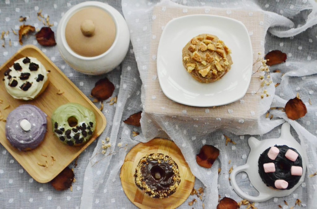
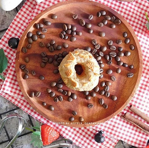
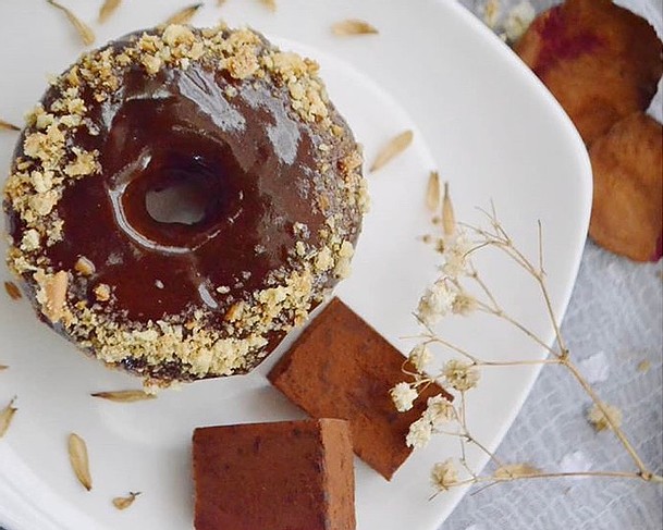
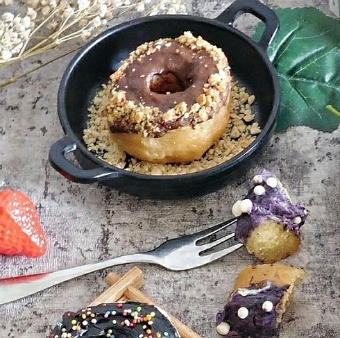
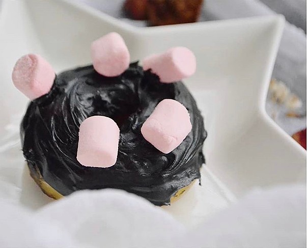
For the main focus of this project, El Único is an online start-up business which specialises on deserts, their main key products includes Donuts with multiple variety of flavours/toppings. As indicated by the name, the new deserts business adopts the Spanish theme, as Él Unico means “The Only One”. In addition, the visual theme of this business should also illustrate the classiness as well as the general colour of a Donut and other desert meals such as churros. The name of the business as well as the selected theme will be considered as a fundamentals for the identity for this new business.
Ideation
As a focal point of consideration for the designing process, the keywords of this deserts business were “Desert”, “Spanish”, and “Classy”.
From the findings of the research, one of the colours included on the Spanish Colour Palette is a beige and brown looking colour. These colours are selected as it closely related to the Classy theme and also, more importantly, highly represents the colour of a Donut. More towards the visual representation of the key product, light brown/beige have presented the colour of a plain Donut, and dark brown indicates the colour of a Chocolate, which is the most general topping/flavour of a donut.

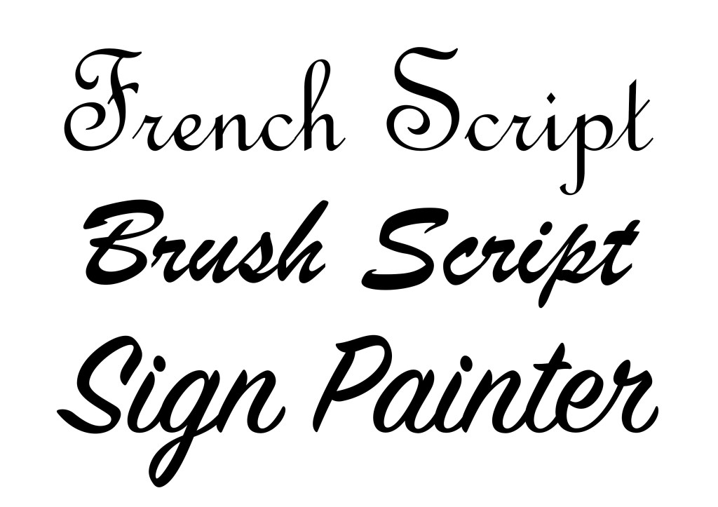
Regarding the typography, 3 possible fonts were nominated that closely related towards the Classy theme. These fonts were then illustrated and consulted in order to select the most optimal one on par with the demanded visual identity of Él Unico and also the selected colour theme for the Deserts Business.
Final Brand Design
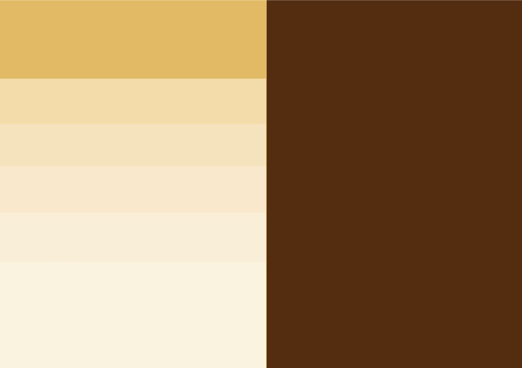
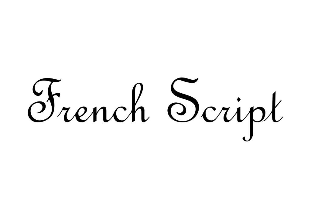
The final design of the Brand Identity and Logo for Él Unico consists of a couple shades of Light Brown in addition to Dark Brown for the colour as it depicts the Spanish and Classy theme and the colours of a Donut, and the typography of French Script as it represents the Classy theme of the business and it is the most optimal in terms of mix match against the selected colours.
As for the symbol, the typeface logo is preferred for this business. The symbol utilises the font and 2 colours mentioned earlier. The symbol itself features the main selected font with a dominant light brown colour which symbolises the colour of a plain donut, the brown accents represents the flavouring of the donut. The combination of the main typography along with the 2 selected colours have presented the Classy image as well as the core product of this business.
Overall, the selected visual aspects for the Logo and Identity of Él Unico have highly present and displays the theme and its key products. The result of the Branding project will give the potential customers as well as the public/visitors in general a favourable initial glance of this new start-up deserts business..

