This project is about the process of rebranding a Tea Shop company in order to improve their company presence and further visualise their identity to the public, which is the fundamental points for a business.
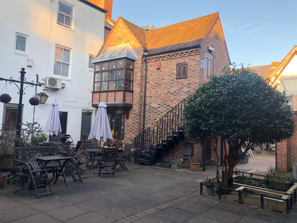
Category: Branding Design. Year: 2019. Design Works Involved: Research, Branding, Graphics
Project Aim:
Initiate an in-depth analysis to enhance the companies’ corporate identity presentation towards its consumers and the general public.

Brand Research
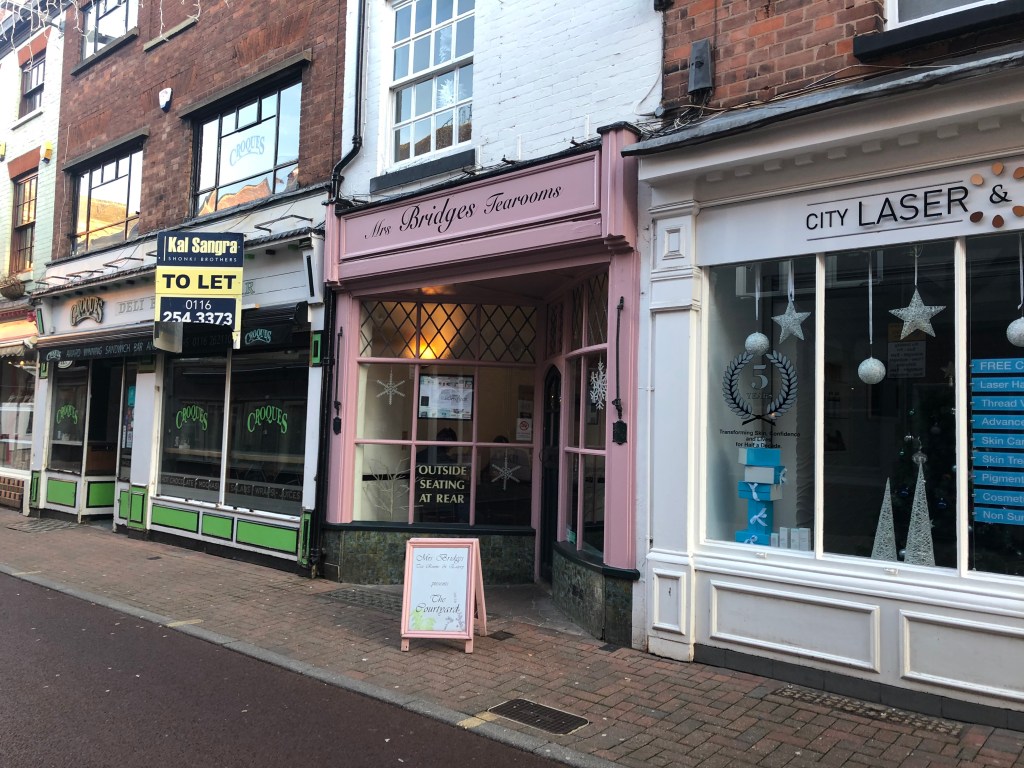
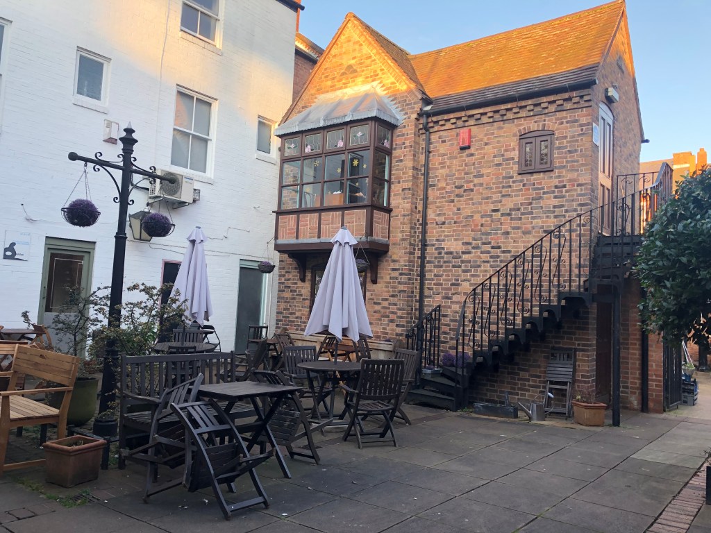
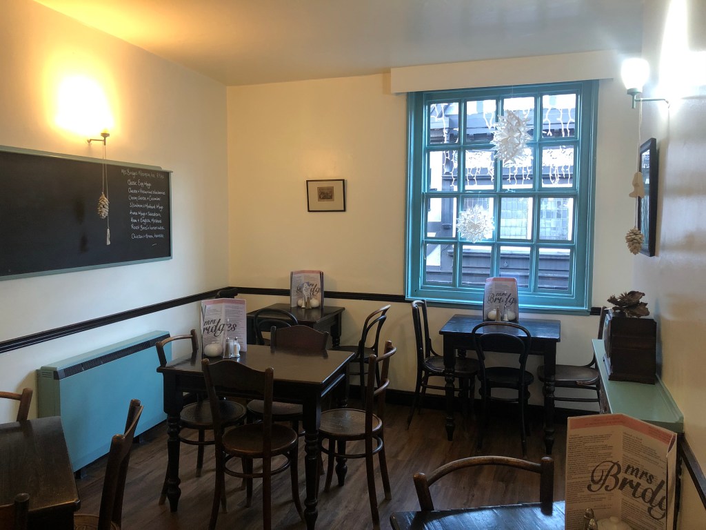
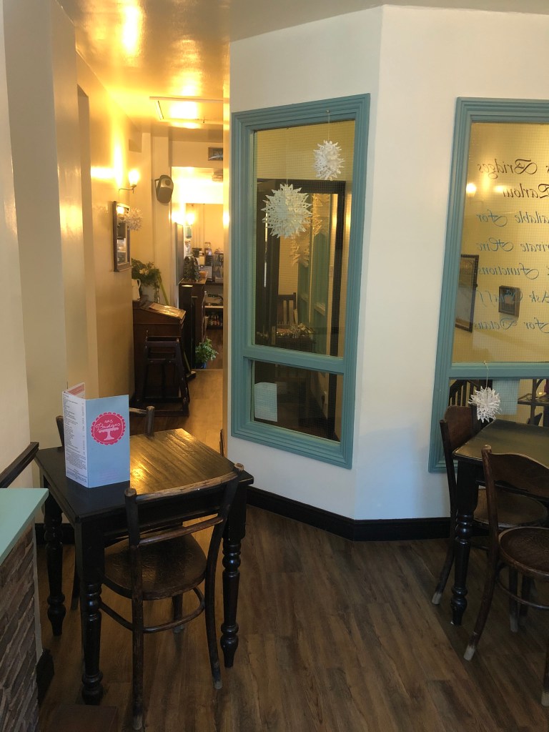
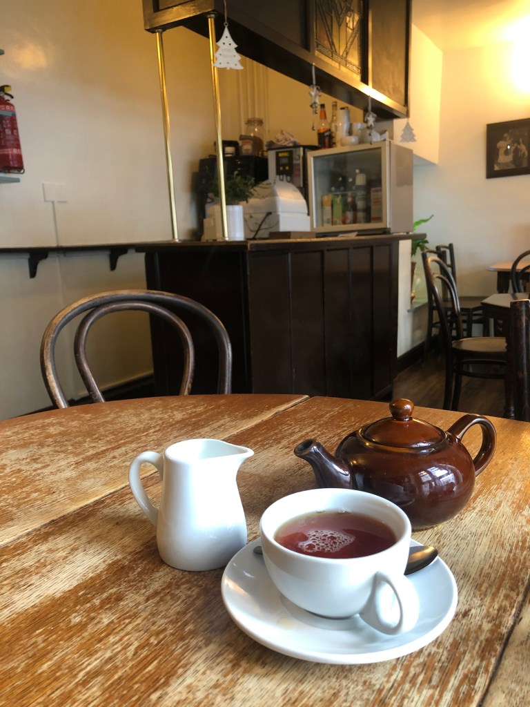
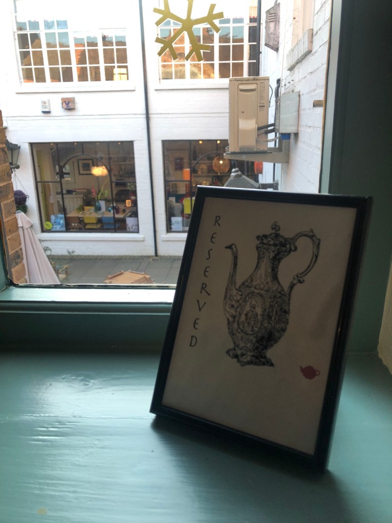
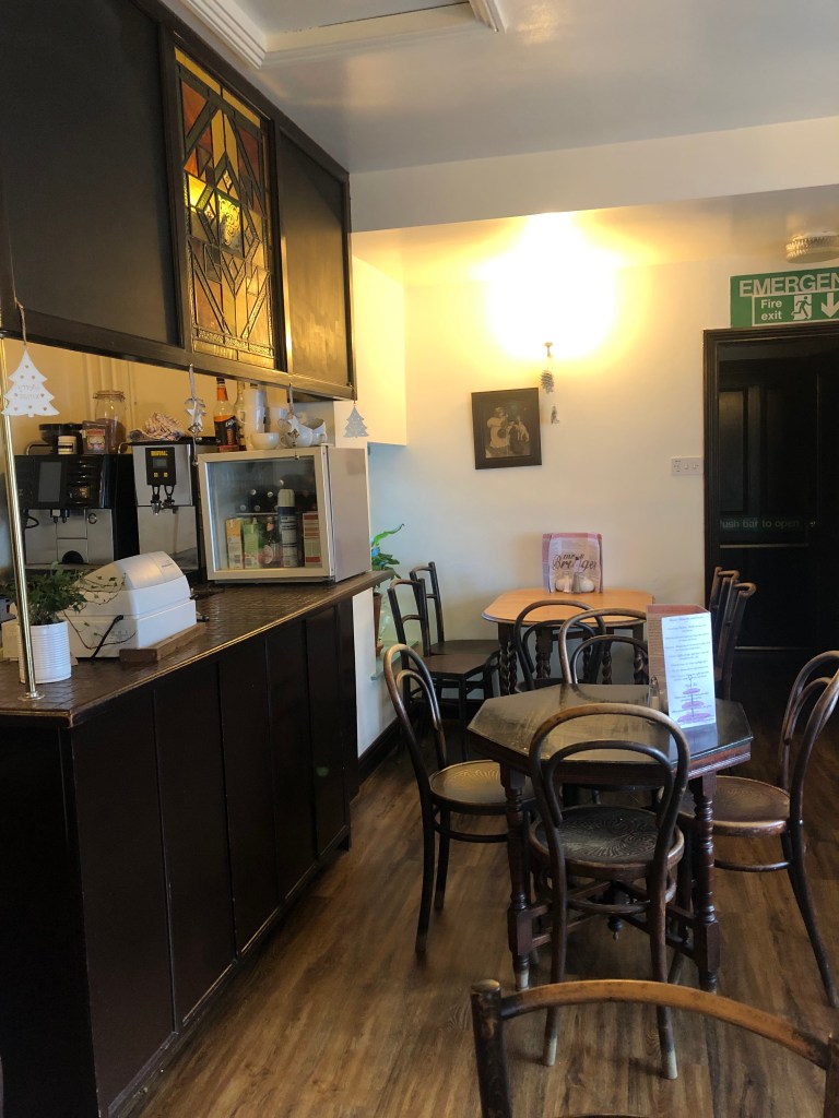
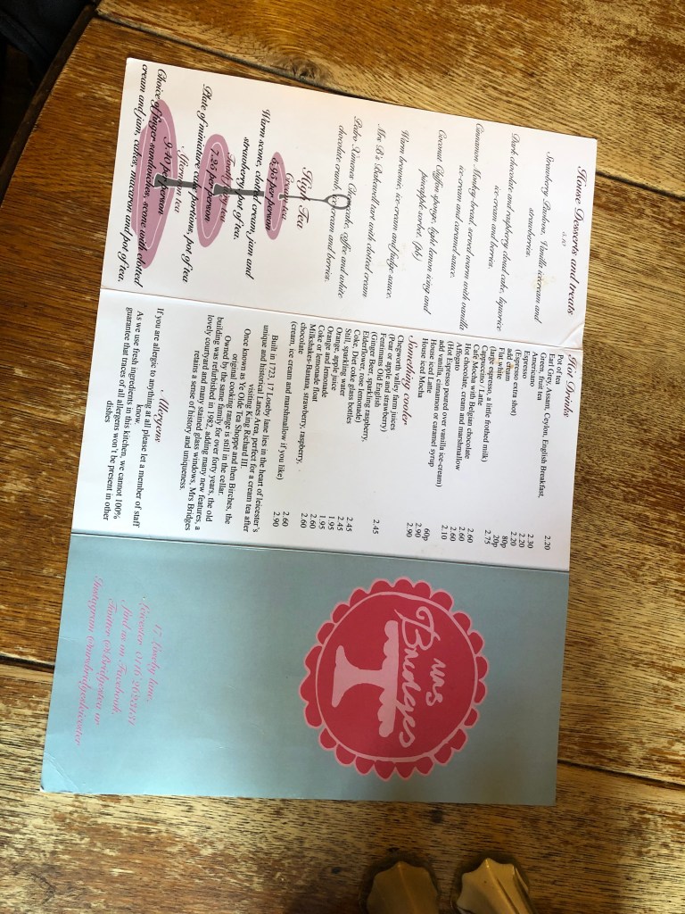
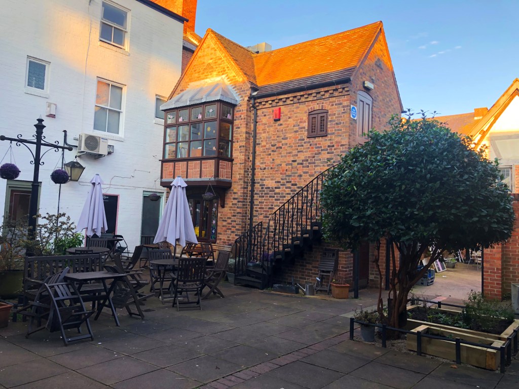
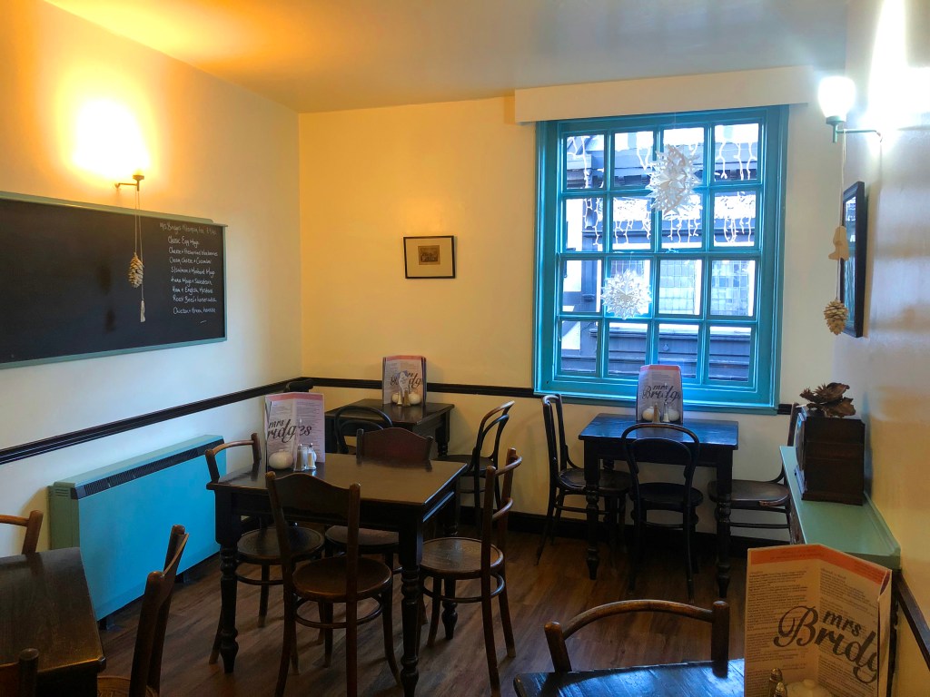
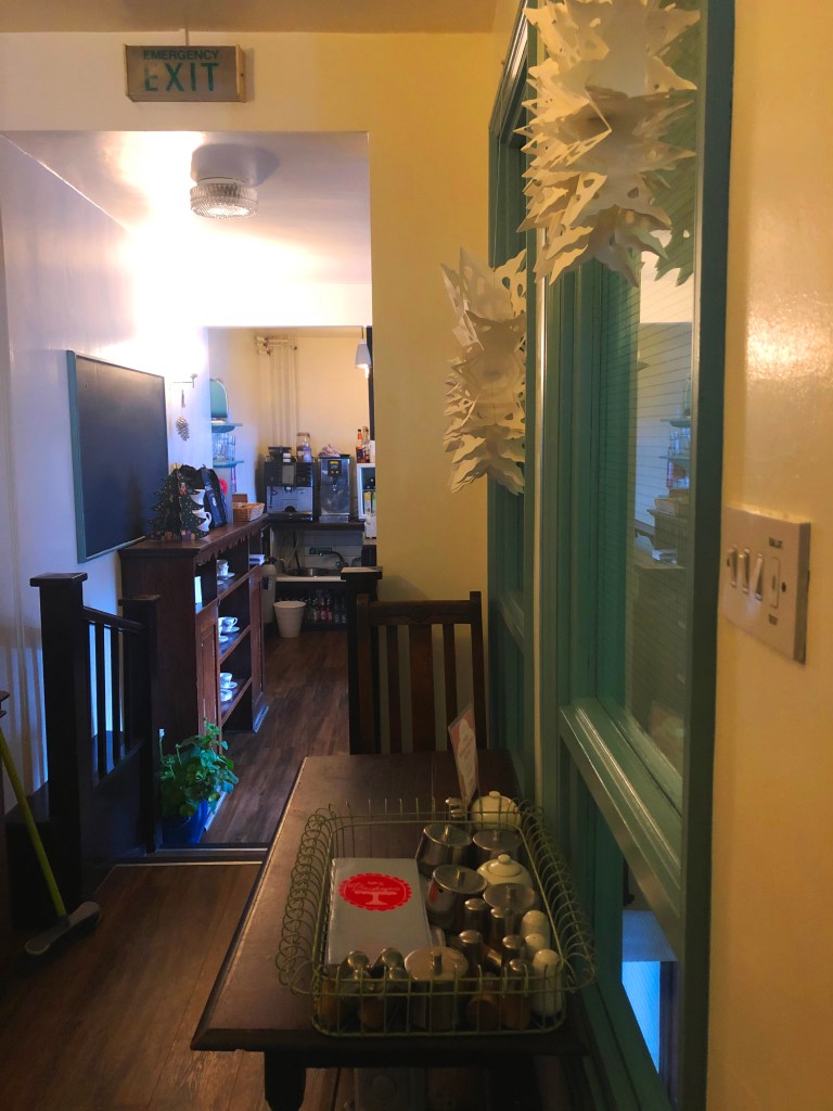
The highlighted brand for the project is a Leicester-based Tea Shop named “Mrs Bridges”. Primary and secondary researches were made towards the Mrs Bridges brand as well as the store itself in order to investigate the brand itself and the problems and other aspects that could be improved. The defects detected were their inconsistent use of colour usage.
To find out the improvements that could have made to the brand, a number of keywords and key products, which is highly considered as a representation towards the brand/company and its unique aspect, is investigated and illustrated within Mrs Bridges.
Highlighted Keywords and Key Products towards Mrs Bridges
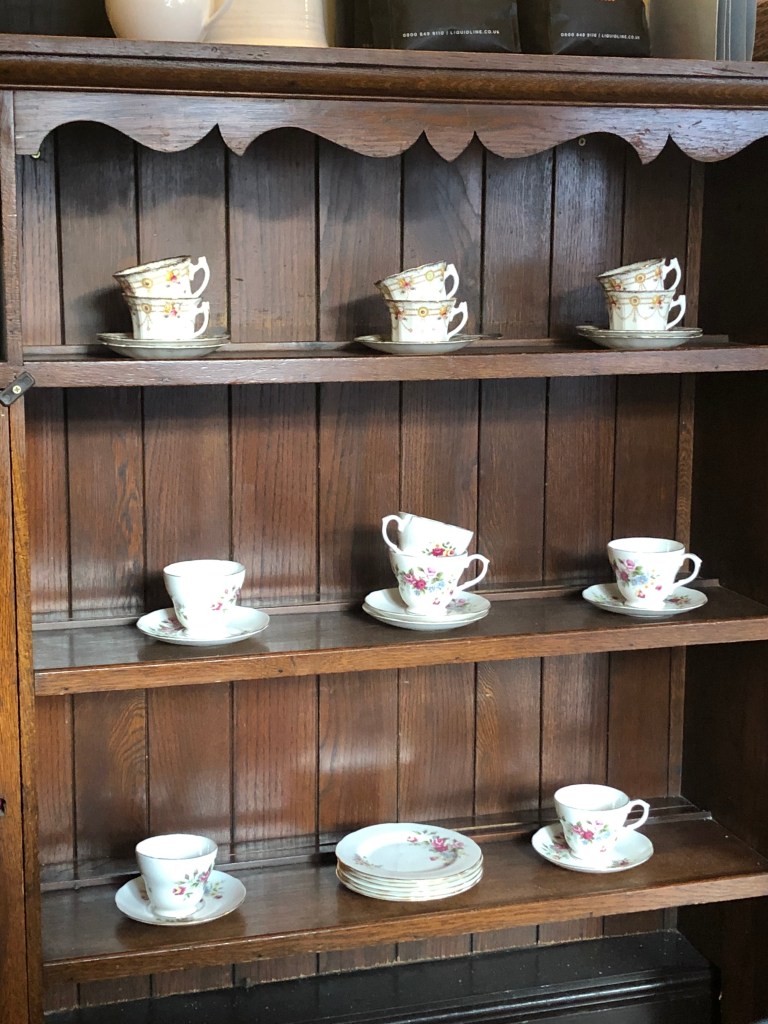
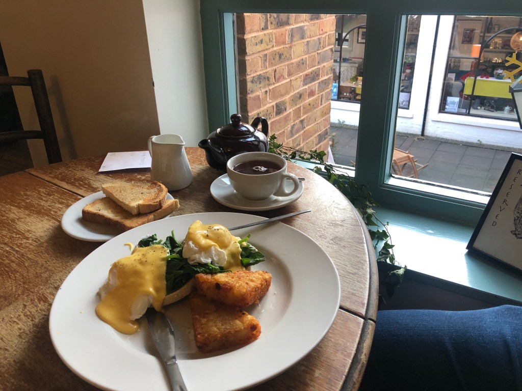
Keywords: Outdoor Seating, Cosy, Casual, Heritage, Breakfast/Lunch Catering.
Key Products: Tea, Coffee, Sandwiches, Desserts, other savouries.
Target Customer Profile
The overall target market of Mrs Bridges is also considered as it highly determines the brand image of the business. Aside from the customer demographics itself, their Psychographic and Behavioural aspects that can be considered as a representation towards the company/brand is also considered.
Based on the secondary research as well as observations within the Mrs Bridges store, “Baby Boomers” generation (Aged 54-72) is the main highlight in terms of target customer, though they often accompanied by their family members. They usually have a hobby of reading, baking, and spend time with their loved ones at home or on cafes.
Competitor Analysis
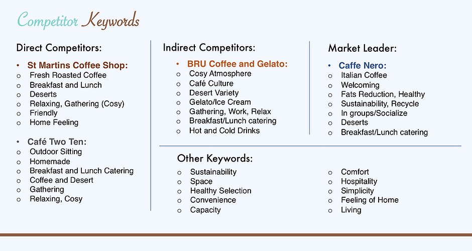
he competition of Mrs Bridges is highlighted for the research in order to scan the overall image within the Restaurant/Cafe sector. The keywords from direct and indirect competitors as well as the market leader within the segment is considered for scanning.
Finding out the average image on companies and competitors within the Restaurant/Cafe sector would determine the brand identity and guidelines for Mrs Bridges.
Brand Guidelines
The selected aspects within the Brand Guidelines were all determined by the research on the Keywords and Key Products of the focused brand, their customer profile, and the average image on the mentioned competitors within the Restaurant/Cafe industry.
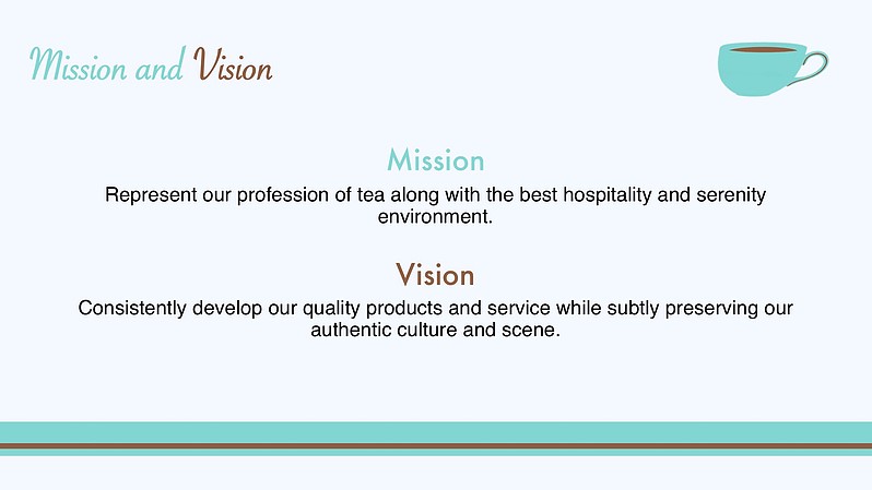


Brand Narratives: Corporate Narratives consists of the Mission/Vision and Promise statements, corporate values and tone of voice, and it is considered as the fundamental prospects as it presents the purpose and aspirations of a business towards its customers.
The selected corporate/brand narratives were mainly about the brand’s expertise towards their core products and the hospitality treatment towards their customers, as well as their overall image of authenticity and heritage. All of which is based on the insights within the Mrs Bridge’s USP and the customer experience within the business.
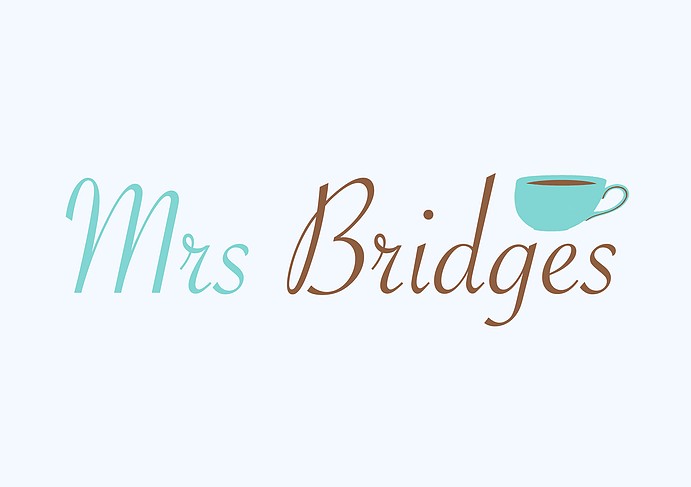
Brand Visual Identity: The visual identity of a brand includes the logo and symbol, the colour and typography usage, and the photography style of the brand. It visually presents the brand’s identity towards the public as well as their customers.
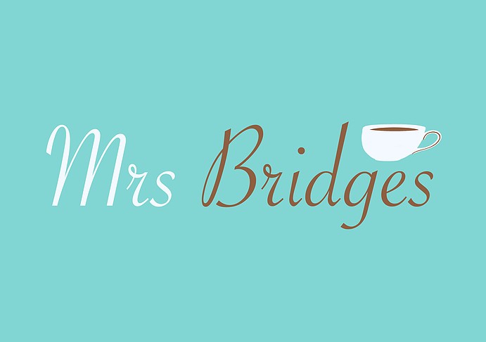
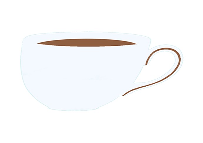
The “Classic Tea Cup” symbol represents the core product expertise as well as their heritage image of Mrs Bridges. The typeface logo, which utilises the “Brush Script” font, represents the classical image of the brand.
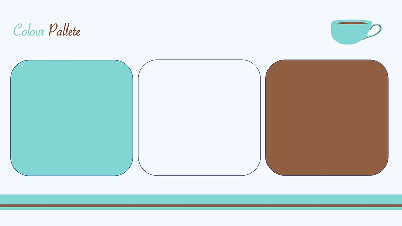
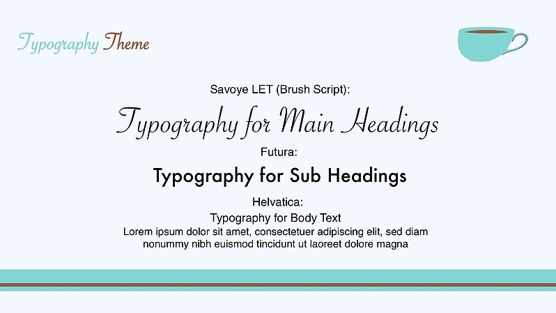
The Brand value of Tea, Cosy, Warm and Welcoming, and Evolving Classic have determined the visual aspects of the brand, which includes the colour, typography and photography. The selected colours were Turquoise Green, Light Blue, and Brown, and the selected typography fonts were Brush Script (Savoye LET), Futura, and Helvetica.
The selected colours represents the trending colour of the 1950s towards this day, and also the colour of Tea. The selected fonts represents the value of modern classic and elegance. The photography style of the brand adopts the Warm filter theme. These visual aspects were summoned for this brand as it represents the companies’ core product of tea, the overall preference towards the Baby Boomers as the brand’s target consumer, and the cosy/classy theme of the brand.


